Bleed & Safe Zones
Bleed area in print is the extra margin that extends beyond the final trim edge so designs run cleanly to the edge without leaving white borders after finishing. Safe zones in print are the inner margins where all important text and images are kept so they don’t get cut off during finishing processes. Files must be supplied with the following:
•3mm Bleed area on each edge
•8mm Safe zone for Perfect Bound brochures & books
•5mm Safe zone for all other print products

Trim Marks
Files must be supplied with trim marks that do not interfere within the artwork trim area, with an offset of 2mm, to show where your print items will trim. Here are good and bad examples:
Correct –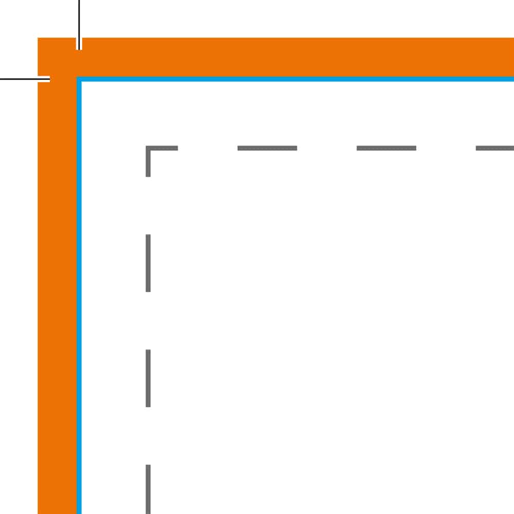
Incorrect – 
Incorrect – 
Colours
We print in CMYK so your file should be supplied in this format, any other colours within your file like RGB will be converted prior to production. To avoid any discrepancies in colours, you should supply files with the following settings:
•Colour Mode: CMYK
•Colour Profile: Fogra 39 (ISO 12647-2:2004)
•Export as PDF/X-1a

Resolution
When submitting files we recommend they should be supplied with a minimum resolution of 300 DPI to get the best prints, anything below this will become pixelated, give a rough edge and will not print as well, as per our example.
300 DPI – 
72 DPI – 
Transparency
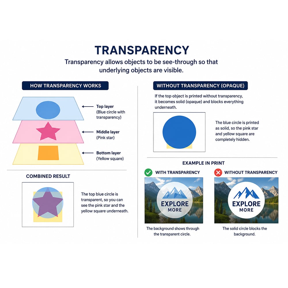
If transparency settings in a PDF are not configured correctly for print production, it can result in printing issues. For example, an object placed on a top layer may print as fully opaque rather than transparent, causing it to block or obscure objects on lower layers within the document. Here’s some things to do to flatten your PDF and avoid transparency issues:
• Save as a PDF/X-1a document
• Save the file as a JPEG, then convert to a PDF
To check how your file will print, open your PDF with Adobe Acrobat, select the ‘Use print production’ tool, then ‘Output Preview’.
Fonts
Option 1 - Embed your fonts
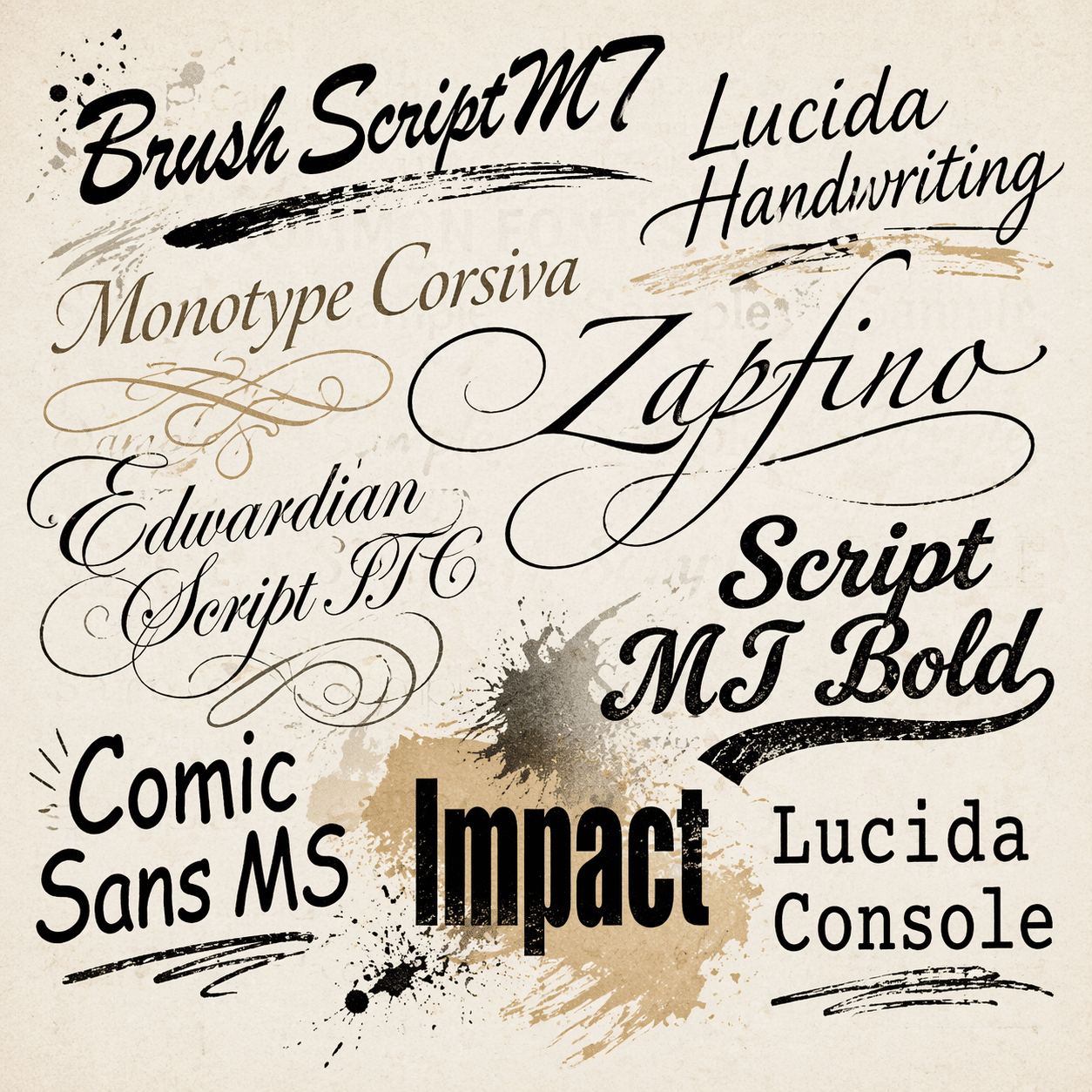
PDF files typically contain fonts that are correctly embedded to ensure they don’t change when viewed on screen or printed. However, when using lisenced fonts you must embed them correctly when exporting to PDF. To ensure this is the case, when exporting your design files to PDF, you’ll be asked if you want to embed the fonts. Choosing ‘Yes’ includes the fonts with the document to ensure corect viewing and printing.
Option 2 - Outline your fonts
In Adobe InDesign and Illustrator you have the capability to ‘outline’ your content, this turns your content into basic shapes (Vector images) which cannot be edited when viewing on another computer or printed.
Option 3 - Convert to images
This is the last resort, converting your file to an image file like a JPEG will create a big picture that has no layers. This means the file will become completely uneditable and will not change whatsoever, fine for short term, but if you want to edit it later on, that won’t be possible.
Read Across Pages
When producing booklets and brochures, creating a large read over on pages creates a great effect, but it should be used carefully to avoid giving readers a bad impression. Here are some examples:
When using a large picture keep the main subject away from the spine of the booklet

Any details in the read across pages is lost within the spine. This is even more prominant when perfect bound as the pages are pinched together and glued
REMEMBER – The same goes for text in read across pages, ensure the letters are not on the spine as they will be difficult to read. It is best to leave a gap in the middle (if it must read across) and carry on the text onto the next page.

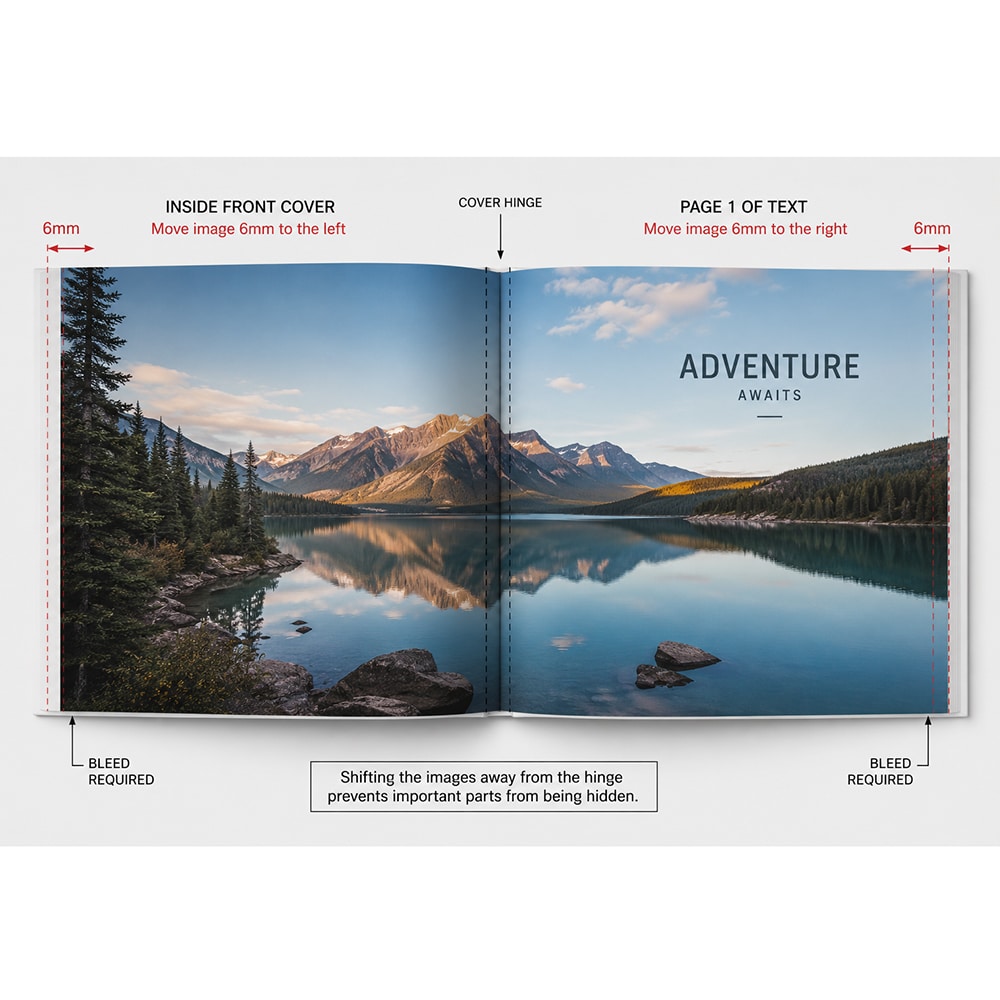
Perfect bound brochures require a bit more thought when introducing read across pages on the inside covers. This is because they use a ‘hinge’ which is created when gluing the books together, it is 6mm on both sides, allowing the book to open easily.
We recommend not having any read across areas on these pages unless you are an experienced artwork designer.
If an image spreads across the inside front cover and page 1 of your book, set up the pages like this:
Move the image on the inside front cover 6mm to the left. Keep the bleed included. This prevents the image from being hidden by the cover hinge.
Move the image on page 1 of the text 6mm to the right. Keep the bleed included. Otherwise, part of the image may be hidden by the cover hinge.
Borders
When having borders on your prints, ensure it is a good size. Anything smaller than 8mm will not give a great effect, this is because there will be small tolerances we work with that won’t be noticed by the human eye. We always recommend a 8mm border to give the greatest effect, whilst keeping your prints looking their best.
Pagination
Whatever product you print decides entirely on what format you need to supply your pages in. Either single pages, spreads or a mixture of both. The page order of your single page PDF must be supplied in the correct order, with the first page at the start and the last page at the end.
The following products require single page PDF’s:
• Business Cards
• Flyers & Leaflets
• Compliment Slips
• Letterheads
• Stapled Booklets & Brochures
• Posters
The following products require spread page PDF’s:
• Folded Flyers & Leaflets (This must be supplied in the correct order for each folding pattern, using our templates for guidance)
The following products require a mixture of single page and spread page PDF’s:
• Perfect Bound Books & Brochures (Covers must be supplied as a spread page PDF, which includes the spine. Text must be supplied as a separate, single page PDF)
Folding Patterns
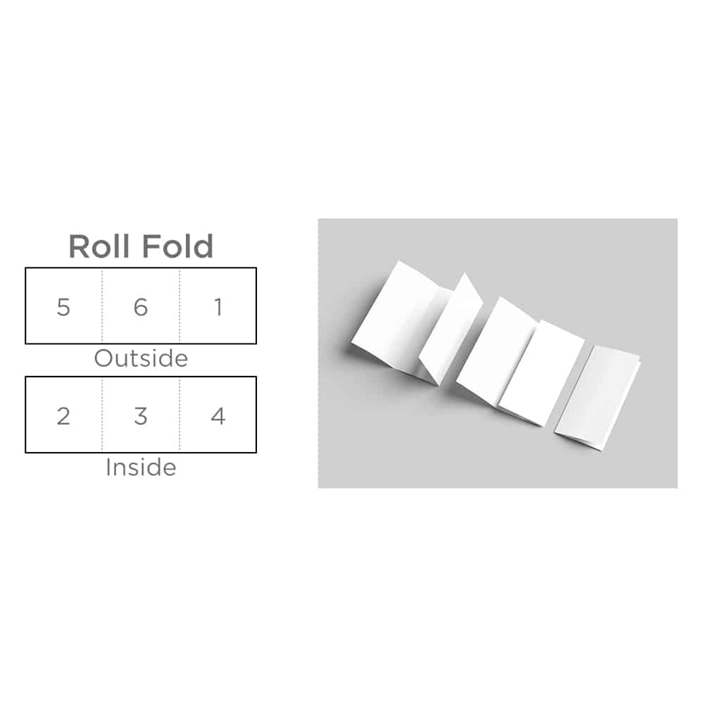
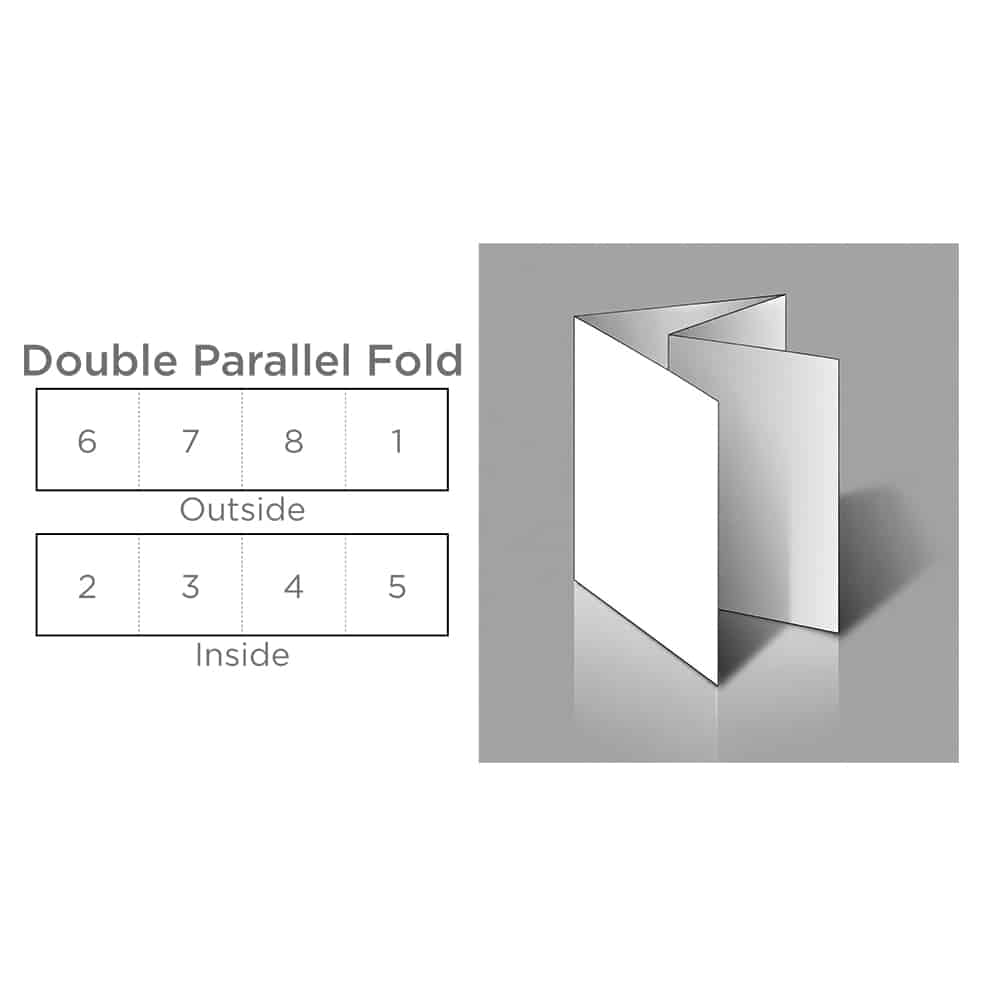
• Ensure all your panels are the same size (except for Gate folds), we adjust it our end for the perfect folds
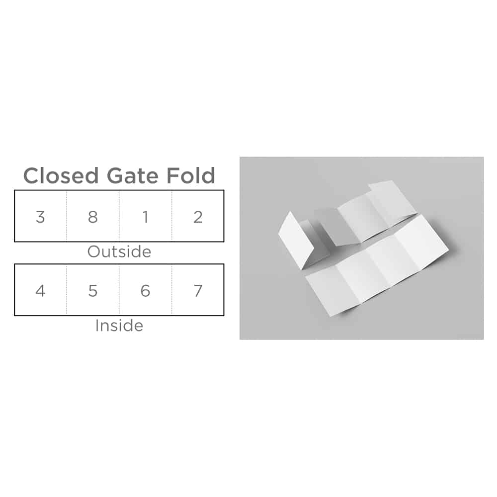
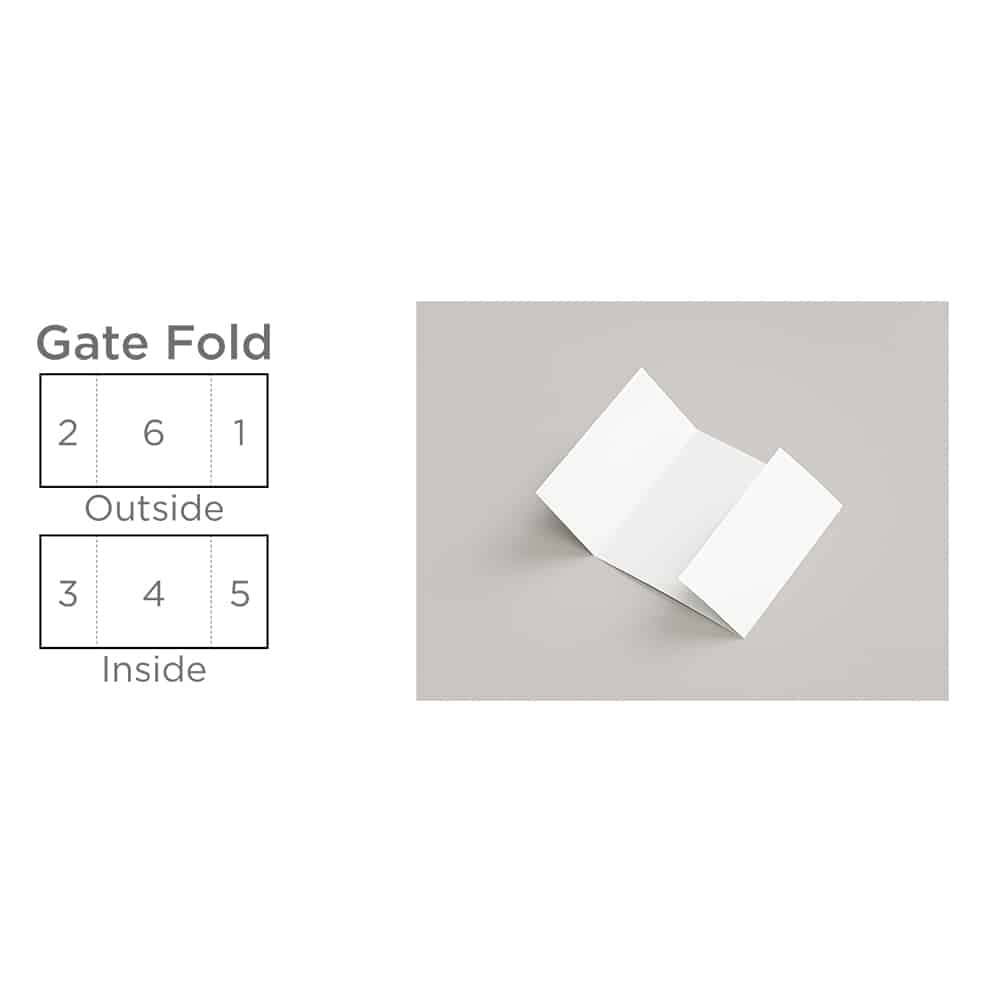
• For Gate folds, the outer 2 panels must be half the size of the centre panel
• Check your panels are in the correct folding order, with your front cover being panel number 1
Half Fold

Roll Fold
Concertina Fold

Double Parallel Fold
Gate Fold
Closed Gate Fold